Flat-Design Best Practices
Since its rise to popularity around 2012, flat design has had an influence on visual-design taste across the web. Flat is everywhere now — Apple, Amazon, Microsoft, and even IBM are flat. This isn’t just a simple web-design trend anymore.
Flat design, especially when combined with strategic minimalism, can be a powerful aesthetic tool. It can convey a sense of luxury or trendiness, and in some cases can be used to appeal to young adult users. It’s a lightweight UI, and can be easier to support across a range of device sizes.
Unfortunately, flat design has a major flaw: it often leads to click uncertainty and decreased user efficiency. When designers flatten the UI, they tend to remove many signifiers that normally tell users where to click. But flat doesn’t have to fail — take advantage of the following strategies to make sure your users don’t become victims of a faulty flat design.
Is a Totally Flat Design Right for You?
Before you jump on the flat-design bandwagon, consider whether this style is best for your organization’s goals. Several factors will influence your potential success:
- Low amount of content and simplicity of information architecture: Ultra-flat designs tend to work better on very small sites (1–10 pages).
- Low amount of interactivity and no complex features: Complex applications or interfaces with unusual interaction patterns will miss out on opportunities to guide their users if they totally flatten their UI.
- High proportion of returning visitors: Sites with high numbers of frequent returning visitors will have more success with flat design. In those cases, users are more likely to eventually learn the interactive paths rather than rely heavily on signifiers.
- Tech-expert target users: If your users are all advanced (designers or developers, for example, or having extensive experience using other flat designs), they will be better equipped to figure out a flat design than a broad consumer audience would be.
Even if your organization’s characteristics fit that list, we usually advise against a totally flat UI in most situations. There are some cases where a totally flat design won’t do much harm — in designer portfolios or very simple marketing sites, for example. Such sites those can benefit from the cool factor of a flat design without sacrificing much usability — because there isn’t much to ‘use’ there in the first place.
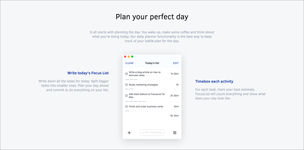
focuslist.co: This site’s only purpose is to market a productivity application. Very simple sites like this one can benefit from adopting a flat design (though not totally flat, thanks to that shadow behind the screenshot).
Most digital products are much more complicated than a single-page marketing site. For those interfaces, we recommend using a semiflat or flat 2.0 aesthetic instead — an evolution of the style which looks much like flat design, but incorporates subtle shadows, highlights, and layers to create some depth in the UI.
One last word of caution: Just because flat designs appear simple doesn’t necessarily mean they’re easier to design. Pulling off a flat design to any degree, from ultra-flat to flat 2.0, will require a talented visual designer.
Strategies for Avoiding Click Uncertainty
If you’re sure a flat design is right for your product, think carefully about how you’ll communicate the clickability of every interactive element — links, buttons, form fields, sliders, and so on.

kentuckyderby.com: When users aren’t sure if something is clickable or tappable, they’ll check by mousing over the element. In this screenshot from an eyetracking study, the user is looking at the subtle change in the cursor and the background color of the menu option to decide where she can click. (Red dots indicate fixations.) Hover-triggered changes in the visual design of the element, or cursor-shape changes (e.g., into a hand) are clues that the element is clickable. Unfortunately, such clickability signifiers are weak and require interaction effort; as a result, they effectively reduce target discoverability.
Never use the same visual treatment for static text and linked text. Don’t use the same color for primary-action buttons and the background on a static heading. Use your visual design to clue users into what’s clickable on your site and what isn’t. Consistency is crucial.
Follow our guidelines for signaling the clickability of text, buttons, images, graphics, tabs, and icons:
- Make sure your buttons at least vaguely look like physical buttons.
- Avoid ghost buttons — text with a thin rectangular outline.
- Make sure smaller items will enlarge when they’re clicked.
- Use standard, recognizable icons in links. With few exceptions, these icons should be paired with label text.
- It’s fine if your tabs have no shadows, just make sure you’re following the rest of our recommendations for tab design.
Use traditional layouts and standard UI patterns as much as possible. With a standard layout, users will easily understand the purpose of each element — even without traditional, strong signifiers. Combining a standard layout with a clean visual design and ample white space helps even more, by making each section of the site more salient and understandable.
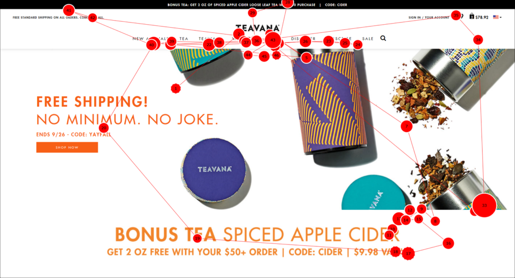
teavana.com: This gaze plot from an eyetracking study shows the first few seconds of a user’s visit to teavana.com. (Red dots indicate fixations.) Because Teavana uses a simple visual design with a relatively traditional ecommerce layout, users had no problem navigating despite its very flat aesthetic. The white space and expected location of the top navigation bar helps users quickly recognize its purpose.
Pay attention to contrast. Make sure your text and elements are clearly legible and noticeable. Light grey on dark grey is a popular approach for flat design, but it rarely works well. Also, be careful when using background images beneath text.
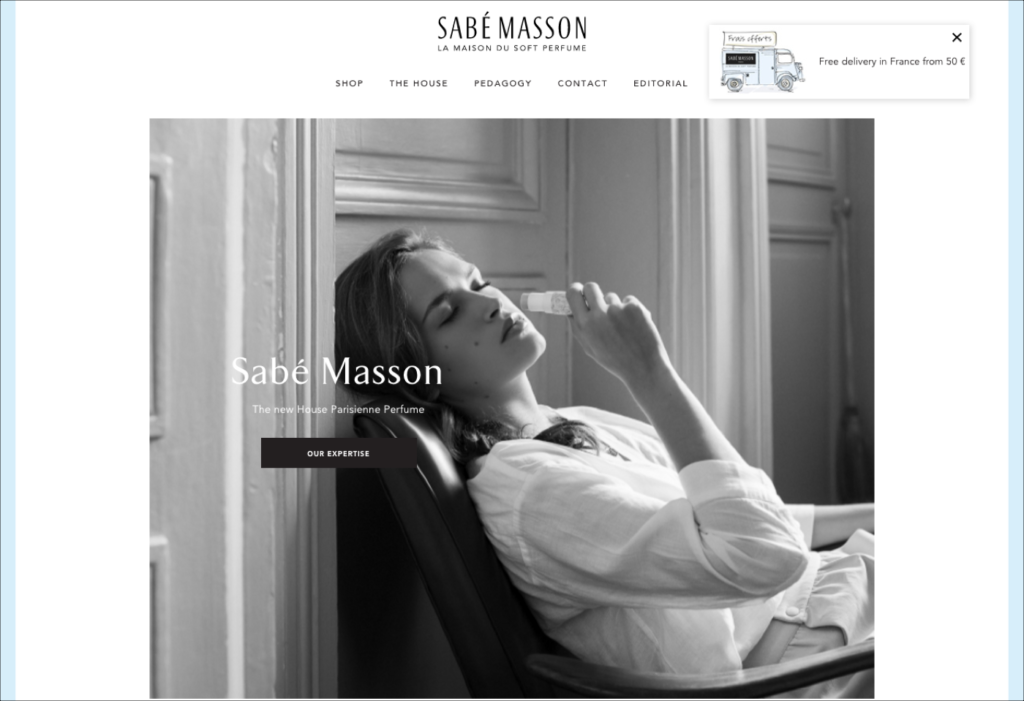
sabemasson.com: The primary action button featured on this homepage, OUR EXPERTISE, is already quite subtle (and poorly worded), but against this large background photo, it’s lost. This design could easily be improved by using an accent color, like a darker variant of the light blue already used in the UI.
Add back in some depth. Flat doesn’t have to be totally flat. Add back in some subtle 3D shadows or layering effects to clarify the relationships between elements.
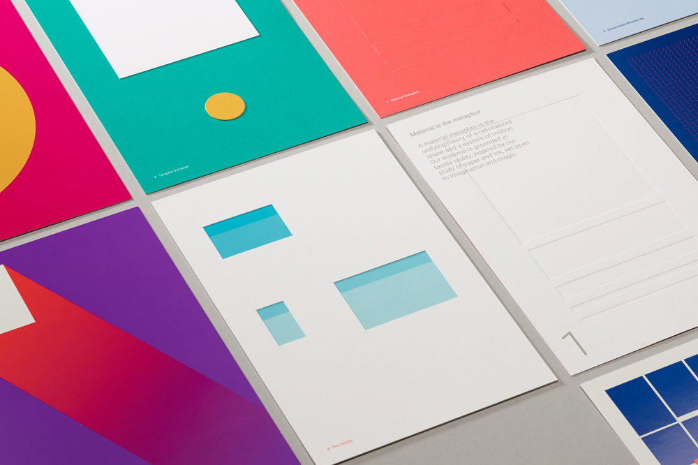
Google’s Material Design, which has been around since 2014, took an admirable stab at this concept. The best thing about Material Design was that it defined a carefully considered framework with specific rules, behaviors, and visual properties. Unfortunately, it’s not always implemented correctly — often shadows and layers are used just to improve aesthetics instead of supporting user mental models and building signifiers. You don’t have to adopt Material Design to get its benefits — create your own design language with semi3D properties.
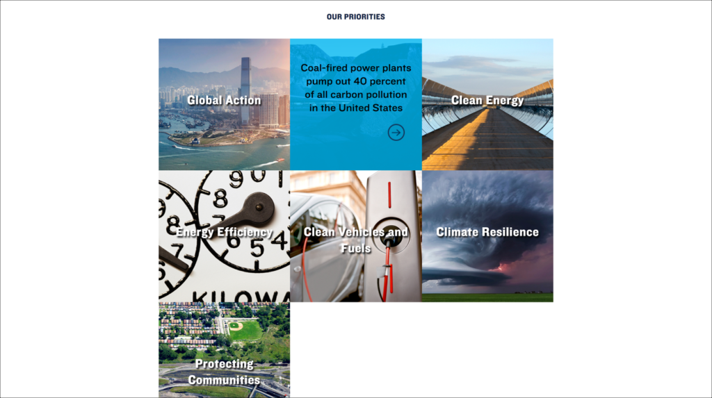
nrdc.org: In this overview of OUR PRIORITIES, users must hover over the thumbnails to reveal text and a link. Unfortunately, only the small arrow icon is actually linked. In situations like these, make all related elements linked.
Conclusion
Flat design is a popular and powerful design aesthetic — when used correctly. Remember that click uncertainty isn’t just a problem for users trying to accomplish their tasks, it also means they’re liable to miss important actions that contribute to business goals. Never sacrifice usability to suit a specific design aesthetic, and always test with your users to make sure they understand your UI.
Review any flat UI against this checklist to check its usability:
Checklist
- Clickability clues are consistent throughout the site.
- Linked elements are salient, have appropriate contrast, and are noticeable.
- Linked elements are located where users would expect them to be.
- There are no ‘red herrings’ — no false targets that look clickable, but aren’t.
- All elements associated to the same piece of content (icon, image, text) are linked and point to the same page.
- Provide feedback whenever there’s a response-time lag between a click and the resulting action.
For more on the issues with flat design, check out our one-hour online course, The Fundamental Flaw in Flat Design. For more general website design guidelines, please see our full-day courses, Web Page UX Designand Emerging Patterns for Web Design.
Taken from the NN/g Neilson Norman Group newsletter


