by Dawn Blanchard
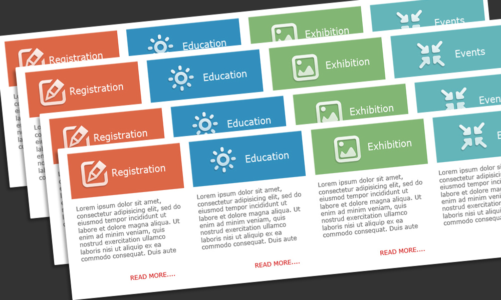
When creating a mockup for a client I’m always torn between grabbing some Greek Filler text (Lorem ipsum etc) or just making up something like “This is a mockup of a great webpage that will work for all users and applications will love it’s fluff.” On the other hand, you can make some guesses and come up with some pretend content that is actually relevant to the application itself. For instance … it’s a budget table, so you create pretend columns, “Year, Fiscal Total, Annual Year, Start Date, End Date, and best of all Active/Inactive.
First, what is the intention of the mockup? A good first mockup will give the business owner an idea of the experience the user will have when entering the site. It’s intended to show the new layout, navigation, how the branding fits into the application/websites look and feel, and how the user might get around. What you don’t want is for the client fixate on the content instead of the mockup.
How many times have you, as a designer, revealed a great new mockup just to have the client ask “What are those column headings? Have those been discussed in User Stories yet. Because I don’t think we even have a “Fiscal Total” in that area.”
“Oh that’s just fill content,” you reply. “Ignore that, it’s just a place-holder.”
“Oh, ok. But please make sure you ask the budgeting SME’s if they need that column.”
Yeah. It’s just filler text, right? Didn’t you just say that? Worse, you can tell during the entire demonstration, business owner is still stressing about that column heading, especially when he brings it up at the end of the meeting.
Why does that happen? I was told long ago in marketing that as humans we are trained – like Pavlov’s dog – to read text whenever we see it, and believe it. So what does that mean to someone viewing and trying to judge a mockup? It means that they will ask questions about the content instead of focusing on the actual visual mockup itself.
I find none of the filler text ideas work as well as simply asking the client for some real data and content that is relevant to that area of the application or website. This helps them feel comfortable with the mockup, like a designer furnishing a room – the visitor can see themselves using the site, and it takes the focus off the content, and on to the actual mockup itself.
A Downside of Fake Copy in UI Prototypes
Here is a video from the nn/g (Neilson Norman Group) on the benefits of using real content over Lorem Ipsum or pseudo-Latin copy during the user interface design process. (2 min. video)
Don’t Take a Chance
I can give you links to great places to find filler text generators, paragraphs of greek text, even a site that creates filler text in French (god forbid one of your business owners speaks fluent French and the text says something offensive). Also, don’t worry if you can’t get real content immediately, that’s not unusual, just be patient. Sometimes there are security issues and the business needs to get internal permission to share real data. That’s when you might be tempted to fall back to filler text.
Don’t take a chance, ask the client for real, simple content, and use that subject or information for all your wireframes and mockups from that point forward (and don’t forget to share with team members so content is consistent). It convinces the client you know the product, and helps them stay on track when considering layout, navigation, usability and overall experience.


Awesome post! Keep up the great work! 🙂
Great content! Super high-quality! Keep it up! 🙂